Overview
In an increasingly online world, a digital outlet to view products of store isn't just nice to have; it's expected. When starting my employement at Alpin Haus, they had yet to reach that point. I hypothesized that an online store would increase digital substantially revenue and would also prove to be an incredibly valueable resource for customers to search brands, products and inventory.
My Role
From the beginning of this project, I was the Product Manager. My responsibilities included:
- Researching the end user & defining persona's, user stories and user journey's.
- Creating & presenting Figma prototype's to key internal stakeholders for C-suite buy-in.
- Designing & building the end product using Shopify & Liquid coding language.
- Defining success by setting KPI's & launch goals.
- Post-launch maintenance and innovation.
Problem
Online stores are becoming an expectation for all brick and mortar stores. It provides customers much more freedom in their shopping choices, allowing them to shop your store after hours, browse inventory without having to visit the store, filter for products by different search terms, and much more. For the creation of this product, we had to walk the fine line of keeping that "local ski shop feel", while also opening the gateway to become a regional online store.
Constraints
- Establishing the brand identity: Alpin Haus is a multi-seasonal brand, and we needed to establish the branding of the online store. Does it remain as only a ski store, or do we include summer pool products?
- No access to a developer, leading to me learning the Liquid coding language as needed.
- Adding this undertaking while maintaining all my other responsibilities.
- Tying in the Shopify ecosystem to an outdated CRM & inventory management system.
Goals
Two high-level goals were defined during the exploratory phase of this product:
- Elevate the shopping experience of local Alpin Haus customers by allowing them to view what is in-stock, and giving them a digital catalog to shop by brand, price, and product.
- Expand the Alpin Haus brand from a local ski shop to a regional store for the northeast ski and snowboard audience.
Research
Summary
I started out researching e-commerce brands: not just how they because successful but why they became successful. What were customers looking for when shopping online?
- 83% of consumers research online before visiting a store in person, and 41% start directly on an online store. Every consumer that went on a competitors online store before visiting us in person had the potential to be a lost customer. (Source)
- 34% of all shoppers shop online at least once a week. If we aren't offering our customers a digital storefront, then we are being forgetten by these shoppers. (Source)
- 56% of online ski equipment purchases are done via a mobile device, emphasizing the importance of a mobile-first design approach as that is the target device. (Source)
Persona
Jake Basset
Full-time college student / part time IT help desk assistant
Meet Jake! Jake is a 19 year old business major who holds a part-time job at his school's IT help desk. He lives in New England, and has been skiing ever since he was a child. his friend group he recently found in college are avid winter skiers, and Jake is hungry to really embrace the ski culture and buy his own setup.
Goals
- Get gear that performs well for his budget.
- Avoid the hassle of driving to a shop mid-semester.
- Use his friends knowledge to get the right gear digitally.
Frustrations
- Many semi-local ski shops do not have an online presence.
- Wants to support local ski shops.
- Sites do not show real-time inventory per store location.
Problem Statement
Jake is a casual skier who needs to be able to browse with the opportunity to purchase ski gear because he has friends who can help him pick the right skis and lives far away from a trustworthy local shop.
User Journey
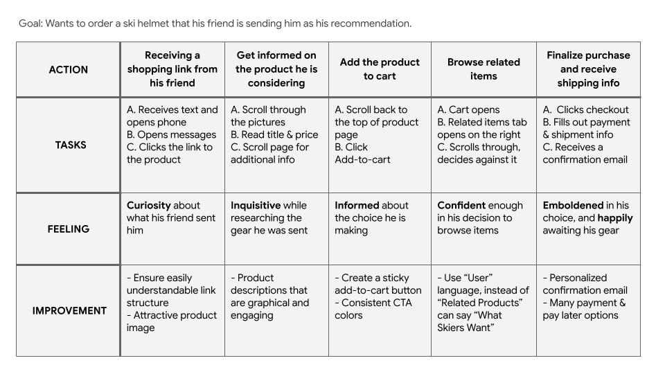
Storyboards
Lorem ipsum dolor sit amet, consectetur adipiscing elit. Sed do eiusmod tempor incididunt ut labore et dolore magna aliqua. Ut enim ad minim veniam, quis nostrud exercitation ullamco laboris nisi ut aliquip ex ea commodo consequat.
Strategy
Summary
Our strategy was built around enhancing our current customers experience when dealing with the Alpin Haus brand digitally, while also slowly scaling our regional presence. We performed competative audits on various local and national competitors, and held the belief that a user-focused approach to all pages & content would lead to us exceeding our goals on our KPIs.
Pain Points
Mobile-first optimization vs. desktop optimization
More than 50% of online shoppers use their cell phone, yet many local competitors still have their website designed for a desktop experience. We needed to meet users on their device of choice.
Ad traffic historically doesn't land on an actionable page
As a user, clicking on an Alpin Haus ad for a sale or new product would land you on an information page. This needed to be solved, and deliver ad engagers to a page they expect to land on.
Real time inventory syncing between locations
Local customers are unsure of what is in stock and in which store. Especially because each Alpin Haus locations has different inventory, having a "in-stock" counter for each location would be an time saver and helpful resource for current customers.
Competitive Audit
Lorem ipsum dolor sit amet, consectetur adipiscing elit. Sed do eiusmod tempor incididunt ut labore et dolore magna aliqua. Ut enim ad minim veniam, quis nostrud exercitation ullamco laboris nisi ut aliquip ex ea commodo consequat.
Local Competitor
- Pros
- Item1
- Item2
- Item3
- Cons
- Item1
- Item2
- Item3
National Competitor
- Pros
- Item1
- Item2
- Item3
- Cons
- Item1
- Item2
- Item3
Design Process
Limitations & Constraints
Lorem ipsum dolor sit amet, consectetur adipiscing elit — e.g. the tech stack you were locked into, tools the client required, or platform constraints that shaped your decisions. Sed do eiusmod tempor incididunt ut labore et dolore magna aliqua.
Sitemap
Lorem ipsum dolor sit amet, consectetur adipiscing elit. Sed do eiusmod tempor incididunt ut labore et dolore magna aliqua. Ut enim ad minim veniam, quis nostrud exercitation ullamco laboris nisi ut aliquip ex ea commodo consequat.
Crazy Eights
Show the rough, early-stage work and briefly explain what direction(s) you explored.
Creating a Low-Fidelity Prototype
Walk through your design decisions: layout, visual design, interaction patterns.
[Bold lead sentence — your single biggest design decision.] [Then 1–2 more sentences explaining why you made that choice.]
Key Takeaways
Lorem ipsum dolor sit amet, consectetur adipiscing elit. Sed do eiusmod tempor incididunt ut labore et dolore magna aliqua. Ut enim ad minim veniam, quis nostrud exercitation ullamco laboris nisi ut aliquip ex ea commodo consequat.
Creating a High-Fidelity Prototype
Walk through your design decisions: layout, visual design, interaction patterns.
[Bold lead sentence — your single biggest design decision.] [Then 1–2 more sentences explaining why you made that choice.]
Usability Testing Findings
Describe your testing method and what you changed as a result. Before/after metrics are powerful here.
[Bold lead sentence — the single biggest thing testing revealed.] [Then 1–2 more sentences on what you changed because of it.]
Final Design
Show the finished, polished product that actually shipped — desktop + mobile if relevant.
Results
Share the measurable outcome after launch, backed by a chart/graph if you have one.
- [Metric 1 — e.g. "$100,000+ in new revenue in year one"]
- [Metric 2 — e.g. "25% increase in qualified leads"]
- [Metric 3 — e.g. "WCAG 2.0 AA compliance achieved"]
What I Learned
Reflect honestly: what would you do differently next time? What's next for this project, if anything?
[2–4 sentences of honest reflection on the project.]